Showing posts with label pillows. Show all posts

Saturday, March 6, 2010

Big Felt Flowers

It's been a while since I have spent some time with one of my favorite craft blogs, the Purl Bee. I particularly enjoy following Molly's Sketchbook, as she specializes in patchwork, and also does a lot of embroidery, Sashiko, and other beautiful stitching projects.

I was quite pleased to see Molly's Felt Flower Pillows project - I love the combo of the cheerful, bold yellow blooms and the more sedate neutral colors. There are so many great felt project on the web, but mostly on a real micro level (eg: verybigjen's amazing pincushions) - I like how Molly's project uses unexpectedly generous pieces of felt.


Sunday, December 2, 2007

Buttery Toasted Patchwork Pillow


I'm having trouble coming up with new words to describe these yellow and brown wool pillows - toasty is first and foremost on my mind when I look at them. I'm working my way through two stacks of felted wool I bought from the City Quilter. They have quite a nice selection - I actually bought a teal/blue spectrum stack as well, but I I've been holding back from starting to work on it, as I feel like I'm on a roll with the yellows and browns.


I designed this pillow while on the subway, but had to improvise once I was actually executing it. These wools are bought in stacks containing beautiful but slighly mishapen pieces - it's not like I have even full fat quarters of any of these, so they almost force you to do patchwork.

I had hardly any light yellow fabric yet, and a lot of brown, so the rows containing yellow pieces ended up being 2" tall while the one containing solely brown pieces were 3". It's very hard to see this, but the corner pieces are a slightly different yellow than the others, again, improvised out of necessity due to not having enough of either yellow color.


I was also planning on having the rows and colums of brown (except the 4 dark pieces) be the same shade of brown, but I discovered that was not to be either. However, I enjoyed the troubleshooting process and was relieved that ultimately I was able to come up with a combination that worked - both in sticking as closely as possible to my original vision, and in having enough fabric to execute it.


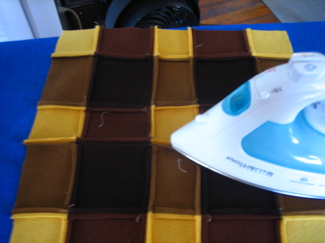
These wool projects take longer than the cotton ones, because pinning and pressing are absolutely key. Pinning is just about the same in difficulty (show above) but the pressing of the wool seam allowances is a bit challenging. In order to prevent bulking up the patchwork, I pressed open the seams.


You really have to presss the hell out of it, and put some elbow grease into it to make it work.
Overall, I'm glad with the results - it lays flatter than my previous wool patchwork project.


The next step was that I hand embroidered the contrast stitching. It's fun to do this with the wool fabric. First of all, I love embroidery. And you don't have to use an embroidery hoop, because the fabric is nice and thick and a little stiff.


And here's a picture of the final product again!

A

Monday, November 26, 2007

Purple Pillow for Michele


I made this purple pillow for one of my best friend's new apartment - actually I made two identical ones for her. I used the same pattern as I did for the bunny pillow and the Joel Dewberry faux bois/birds pillow.

The flowered fabric is a Japanese imported fabric I bought from purl soho, and the striped fabric is from the American Jane series from Moda. I think it's an ideal stripy fabric, and it comes in lots of nice colors that have the feeling of being just slightly faded.

You may notice that I'm trying to make a leap forward here in terms of setting "set dressing" my photos. The chicken and I enjoyed playing with props and creating a "view in a room" feeling (like in westelm.com) though there's a lot more I'd like to learn about my camera in terms of light and clarity.

Wednesday, November 21, 2007

French Knot/Stacked Coin Pillow - First Etsy Post!


After many months of putting it off, I've finally opened my Etsy store!! You can check it out here:

http://swallowdesigns.etsy.com

... and this project is the first item I've posted there!

This is a fairly unique project for me, because I did it pretty much on the fly - I didn't sketch it out on graph paper beforehand. In fact, what I really wanted to do was something more liked a traditional "stacked coin" design. I'm having trouble finding a definition of what this means, but as far as I can tell it's essentially a design that incorporates strips of stacked patches, framed in neutral sashing.

I wanted to show you some examples on Flickr but got these results instead.

This quilt from Miss MeShell was really the inspiration - I love how she combined a deliciously simple linen with citrusy fabrics. She blogged it here and it's well worth checking it out!

My project veered off this plan, as you'll see soon...


I started with a pile of strips from my scrap box. I sorted them out for the blues, oranges, tans, and browns - which wasn't really hard because most of my projects lately have been in those spectrums. It was more a matter of weeding out the odd green scrap.


This part of the process went super-quick - I actually placed the sewing machine on my ironing board and did the whole thing standing up. This saved a lot of time. Plus it made it easier to watch TV. Can you tell I like to multitask?


I ironed each strip just before sewing it to the previous one, but I didn't iron the whole patched piece until I was done. Enjoyably spontanous compared with some of my more laborious projects, and certainly efficient.

When I finished preparing the large strip patch, I cut it into 4 pieces. However, after some thought, I ditched the traditional vertical parallel lines of stacked coins. I didn't have any linen, and it just didn't look as cool on the dark brown background.


So, I decided to use them as a frame for one of my French knots projects. I made this particular one a while ago, and they were inspired by the Connect the Dots tutorial from the purl bee, one of my favorite blogs from my good friends at purl soho. And by good friends I mean advisors/teachers/dealers of irresistable fabrics!


The back is an envelope flap, using the remaining "stack coined" (if I can call them that) strips:


Remember folks, this item is actually live and on sale on my store on Etsy! Why now? How did I finally set it up? Well, I ran out of room for my pillows. I'd love to keep them all, but there's only so much room I have on my bed and couch. The good thing is, it frees me up to use different colors - ones that don't match my lamp, sheets, and other accessories. I'm looking forward to seeing how that frees up my creative process.

Tuesday, November 13, 2007

Toasty Wool Pillow for Icebat


I just completed my second wool pillow. I made it for Icebat. Like the last one, it was inspired by the Japanese book "wool patchwork: warm quilt for the home."


I purchased these packs of felted wool from The City Quilter. They are from Wild Thymes Pattern Co., and they look quite appealing in their little stacks.


I was inspired by this lovely picture from the book. I love how their version is both wooly and lemony at the same time.


They have some instructions in Japanese in the back, but I could figure out what I wanted to do by looking at the photo, so I didn't refer to them. Here's my quick sketch for my version of the project. I carry around a little notebook of graph paper for this purpose - sometimes I work things out on the subway. This is one of the simplest designs ever - it's almost embarrassing to put it here:


I'm finding using the cotton fill pretty liberating, because when I use it I'm not married to any particular pillow size. I decided to make the pillow 12" x 12" because I thought it would be cute.

I played with the squares until I got something I liked:


I don't know if you can see it here, but there is a nice herringbone mixed in there. These little pieces of wool are rather expensive, and I caught myself obsessing at a brunch this weekend over my friend's vintage pants. I can see myself going out and trolling the flea markets for some old clothing - because if I'm going to continue with the wool pillow making I need to find a cheaper way to do it.


The wool was considerably more difficult to iron than the cotton quilt fabric I'm used to. I normally iron both the seam allowances in one direction, but with the wool, I carefully pressed the seam allowances open so that they wouldn't be too thick. I really had to lean on the iron to get those seams to stay down!

Then I took a bowl of pom-poms, sat down with my favorite cup of tea, and set upon the task of sewing those cute little pom-poms onto the pillow top. This is a good activity to do while watching TV.


Cute as a button! I like how Icebat looks both bashful and proud in this picture - I intentionally chose the pom-poms to match him. Ta-da!

Monday, October 22, 2007

Bunny Pillow - complete!


I finished the bunny pillow I started last week. I really think this is one of my favorite patterns so far. I have sketched out how I might execute it as a quilt. I'm feeling very enthusiastic about this - though I've never quilted anything but a small piece of muslin. However, I'm taking a couple of quilting classes at the City Quilter next month - two couple hour workshops - machine quilting and freestyle machine quilting.

I have a few good books on quilting - but I just haven't been able to take the plunge into actually doing it. I'm even intimidated by "stitch in the ditch." I know I should try it on something small like one of my pillow tops, but I hate the idea that I could ruin my hard work on the patchwork by amateurish quilting.


Here's a side view of the pillow - I love the combo of the colors and patterns. I'm sticking with this tangy navy and orange theme for a lot of my patchwork pillow variations. It hasn't been done in recent CB2 and West Elm and the other catalogues or magazines I get, so it feels fresh to me.


Here's one more beauty shot!

Fabric credits:
Orange stripes - from the American Jane series
Bunnies - Japanese import
Border/flowers - Denyse Schmidt Katie Jump Rope series

Sunday, September 30, 2007

Japanese Quilt Block: Spring Pillow for Fall


Here's my latest pillow, which is based on a block from the inspiring book Japanese Quilt Blocks to Mix and Match by Susan Briscoe. I just discovered her website and I'm thinking about reaching out to her - I've gotten so much out of this book! I'm hoping she might like to see some interpretations of her work.


I also have her book The Ultimate Sashiko Sourcebook, but I'm trying to resist the siren song of sashiko as I already have my hands full with an ambitious original embroidery project.

As folks who read my August posts know, I've been experimenting with patterns (primarily using dark blues) from this book, including:

Block #14: Kurume kasuri musubi (knot)
Block #5: Kurume kasuri igeta (Kurume well curb)
Block #6: Yamato kasuri igeta (Yamato well curb)

For this next pillow my specific goal was to enliven up a room that was somewhat depressingly matchy-matchy, and I wanted it to go with the colorful Heather Bailey pillow I'd already made for the bed.


I wanted to chose a design that would showcase Heather Bailey's bold fabric from her Freshcut series. Briscoe's book has a few patterns that remind me of a frame or window onto a vista, giving the block an elegant dimensionality. I settled on block 29 - Yosegi koshi kumitate (check frame).


I sketched out my interpretation of the block on graph paper. All the designs in the book are for 9" quilt blocks. I prefer the look and size of 16" square pillows but I wasn't up to doing the math - I simply "doubled the recipe" to make it for an 18" pillow.

Briscoe's designed calls for 2 different background colors, with the middle square cut on a diagonal. I merged these into my one featured fabric.


I went about this project very carefully and methodically, because it involved a lot of small pieces, and a "fussy" piece of fabric - fussy meaning that I wanted to keep the pattern framed in a specific way, so it was important that I didn't get confused and turn a piece upside down or change its orientation in the block.


I generally like to take shortcuts, like cutting as I go, or piecing together multiple strips fabric and then cutting them, but I knew there were too many potential pitfalls to take this approach.


The only shortcut I took was string-piecing the smaller pieces.


I enjoyed taking photos in the natural light!


I followed the instructions to end up with three large strips:


You'll notice by this point the natural light has faded as I push the project into the evening...


Finally done!

As usual, I put some special effort into the back:


I love to look at all the colors and patterns together:


... and somebody else does too!

Friday, September 28, 2007

This is Breakfast Boy


Pillow: Breakfast Boy
Model: Tar

This is Breakfast Boy. Breakfast Boy is one of my favorite pillows.


He is smiley and friendly and eager to please.

Breakfast Boy is based on a photo from a 1964 Physique Pictorial that I picked up in Provincetown. The history of physique magazines is interesting - from the excellent Planet Out article by David Bianco (who has a pretty interesting background himself):

'Bob Mizer was only 23 when he started AMG [publisher of Physique Pictorial] and its catalog in 1945. He originally operated out of a spare room in his mother's house. She wasn't particularly happy that he was gay, but she cooperated because she liked the extra income he shared with her. When Mizer's business boomed, he built a separate studio next door to Mom. He recruited models at gyms and along Venice Beach, searching for a particular type: chiseled, muscular, white. Many of the models he hired were heterosexual.

Popular demand for these homoerotic images grew, and Mizer looked for another way to distribute them. In 1951, he began publishing Physique Pictorial, a pocket-sized magazine created especially for a gay audience..."


Here's the cover of the issue Breakfast Boy's photo appeared in. Don't you just love the font? Yes, that woodgrain fabric is from Joel Dewberry's Aviary line. I just love to pair partial nudity with woodgrain.


The model's name is Gerald (Gerald?!) and is described here in great detail for his stats (including ankle, not pictured). He apparently "works as a salesman but wants to be an actor, or anything else that brings him lots of money." Hmmm.

More from the David Bianco's article:

'Because of the oppressive atmosphere of the 1950s, physique magazines were careful to disguise their homoerotic intent. Postal inspectors and FBI agents were on the lookout for pornographic content, such as "excessive genital delineation." They particularly targeted gay publications, trying to indict them for violation of the 1873 Comstock Act, which prohibited sending obscene material through the mail. To avoid harassment, Physique Pictorial adopted a lofty mission statement: "A fine healthy physique," it claimed, was "a great compliment to our creator who planned for the utmost perfection in all of his universe." A beautiful body, according to Mizer's publication, "makes the soul sing."'


Sigh. You may notice that the photographed model carefully avoids said "excessive genital delineation." He also apparently isn't cooking anything. I took a little creative license here - added back in the genital delineation, and gave him some fried eggs!


The yolks of the sunny side up eggs represent the first instance that I did a solid fill in embroidery.

Isn't he a charmer?